View on GitHub
 TabBarUIAction Reference
TabBarUIAction


📚📱 A SwiftUI custom TabBar view with action button for modal content display. Fully compatible with Mac Catalyst. 📚📱
Installation
There are three ways to install TabBarUIAction in your project: manual installation, as a standalone framework or using cocoapods.
Manual installation
To manually install TabBarUIAction simply drag and drop all the file contained in the Source folder inside your project.
Framework
TabBarUIAction is available also as a framework. To install it follow the standard installation procedure for a cocoa touch framework:
- drag the TabBarUIAction.xcodeproj inside your project
- add it to the Embedded Binaries/Linked Frameworks and Libraries section of your project.
See the TabBarUIAction demo project/target for an example of the setup of the framework.
CocoaPods
TabBarUIAction is also available as a pod on CocoaPods.
Add the dependency to your Podfile similar to the following:
target 'MyApp' do
    pod 'TabBarUIAction', '~> 0.8'
end
and then run pod install (or pod update).
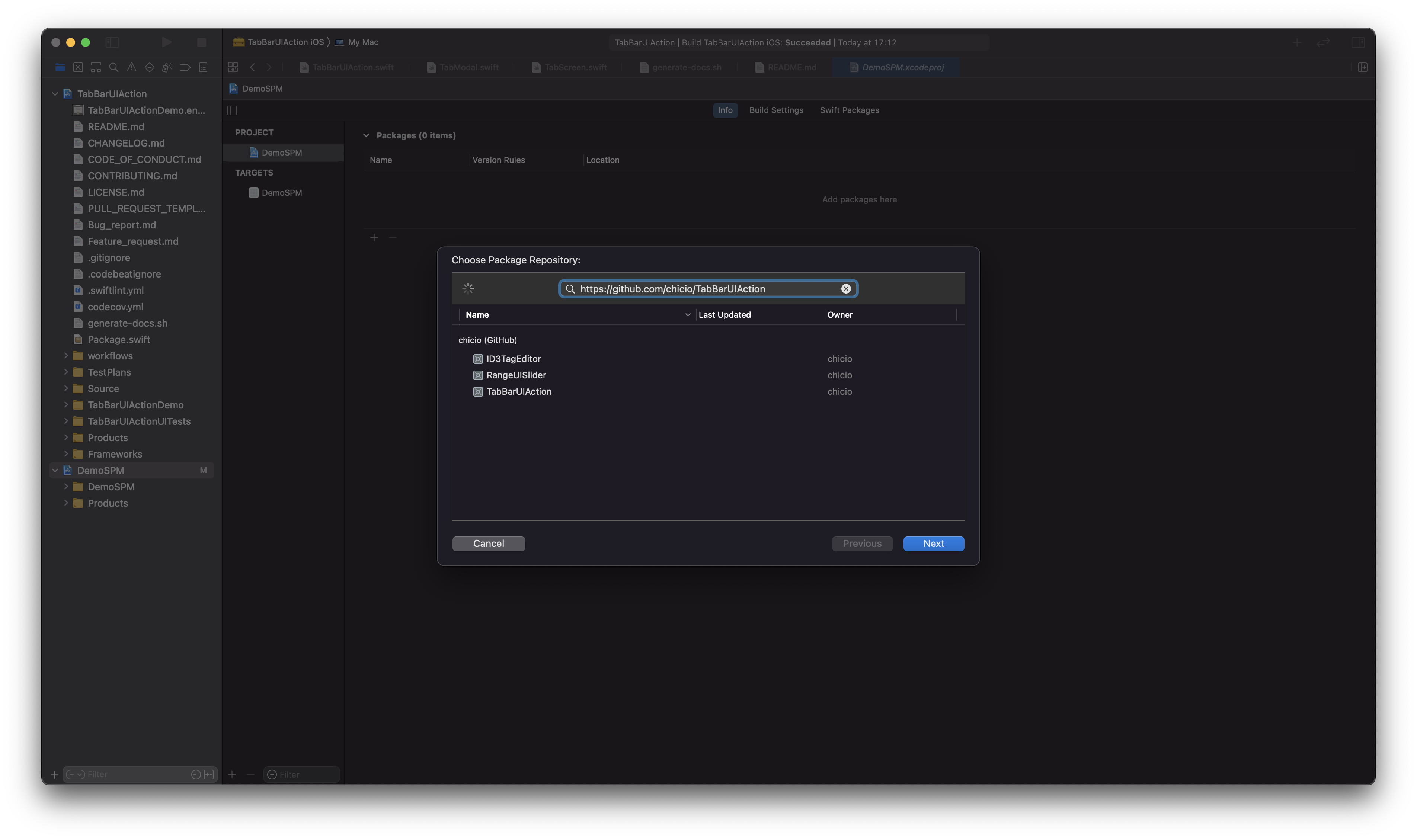
Swift Package Manager (SPM)
TabBarUIAction is also available as a SPM package. Add it from the project configuration using the Github repository url. Choose main branch or a tag.
See the DemoSPM project for an example of the setup with the Swiftp Package Manager.
Usage
To use TabBarUIAction in your app you have to:
- import
TabBarUIActionin your SwiftUI view - define two
@Statevariables:- a
currentTabstate variable of typeTabPosition - a
showModalstate variable of typeBool
- a
- configure it with colors and screens content
Below you can find two examples of tab bar:
- one with 3 screens: 2 standard tabs screen and a modal.
- one with 5 screens: 4 standard tabs screen and a modal.
import SwiftUI
import TabBarUIAction

struct YourView: View {
    @State private var currentTab: TabPosition = .tab1
    @State private var showModal: Bool = false
    //... other state of your views

    var body: some View {
        VStack {
            TabBarUIAction(
                currentTab: $currentTab,
                showModal: $showModal,
                colors: Colors(
                    tabBarBackgroundColor: Color(.white),
                    tabItemsColors: TabItemsColors(
                        tabItemColor: Color(.black),
                        tabItemSelectionColor: Color(.blue)
                    )
                )
            ) {
                TabScreen(
                    tabItem: TabItemContent(
                        systemImageName: "folder.badge.plus",
                        text: "Tab Item 1",
                        font: Font.system(size: 16)
                    )
                ) {
                    /**
                        Your first tab screen. Could be any SwiftUI view.
                        For example...
                    */
                    VStack {
                        ///...other content
                    }
                }
                TabModal {
                    /**
                        Define an element to be used as tab bar modal item.
                        Here you can find an exampl: an image used as button.
                     */
                    Image(systemName: "plus.circle.fill")
                        .resizable()
                        .aspectRatio(contentMode: .fit)
                        .frame(width: 55, height: 55, alignment: .center)
                        .foregroundColor(Color(.systemBlue))
                        .background(Color(.white))
                        .cornerRadius(55/2)
                        .overlay(RoundedRectangle(cornerRadius: 55/2).stroke(Color(.blue), lineWidth: 2))
                        .accessibility(identifier: "TabBarModalButton")
                } content: {
                    /**
                        Your modal screen. Could be any SwiftUI view.
                        For example...
                    */
                    VStack {
                        ///...other content
                    }
                }
                TabScreen(
                    tabItem: TabItemContent(systemImageName: "gear", text: "Tab Item 2", font: Font.system(size: 16))
                ) {
                    /**
                        Your second tab screen. Could be any SwiftUI view.
                        For example...
                    */
                    VStack {
                        ///...other content
                    }
                }
            }
        }
    }
}
import SwiftUI
import TabBarUIAction

struct YourView: View {
    @State private var currentTab: TabPosition = .tab1
    @State private var showModal: Bool = false

    var body: some View {
        VStack {
            TabBarUIAction(
                currentTab: $currentTab,
                showModal: $showModal,
                colors: Colors(
                    tabBarBackgroundColor: Color(.systemGray5),
                    tabItemsColors: TabItemsColors(
                        tabItemColor: Color(.systemPurple),
                        tabItemSelectionColor: Color(.systemIndigo)
                    )
                )
            ) {
                TabScreen(
                    tabItem: TabItemContent(
                        systemImageName: "tray.fill",
                        text: "Tab Item 1",
                        font: Font.system(size: 12)
                    )
                ) {
                    /**
                        Your first tab screen. Could be any SwiftUI view.
                        For example...
                    */
                    VStack {
                        ///...other content
                    }
                }
                TabScreen(
                    tabItem: TabItemContent(
                        systemImageName: "gamecontroller.fill",
                        text: "Tab Item 2",
                        font: Font.system(size: 12)
                    )
                ) {
                    /**
                        Your first tab screen. Could be any SwiftUI view.
                        For example...
                    */
                    VStack {
                        ///...other content
                    }
                }
                TabModal {
                    /**
                        Define an element to be used as tab bar modal item.
                        Here you can find an exampl: an image used as button.
                     */
                    Image(systemName: "plus")
                        .resizable()
                        .aspectRatio(contentMode: .fit)
                        .frame(width: 30, height: 30, alignment: .center)
                        .foregroundColor(Color(.white))
                        .padding(10)
                        .background(Color(.systemRed))
                        .cornerRadius(10)
                        .overlay(RoundedRectangle(cornerRadius: 10).stroke(Color(.systemRed), lineWidth: 2))
                        .accessibility(identifier: "TabBarModalButton")
                } content: {
                    /**
                        Your modal screen. Could be any SwiftUI view.
                        For example...
                    */
                    VStack {
                        ///...other content
                    }
                }
                TabScreen(
                    tabItem: TabItemContent(
                        systemImageName: "dpad.fill",
                        text: "Tab Item 3",
                        font: Font.system(size: 12)
                    )
                ) {
                    /**
                        Your first tab screen. Could be any SwiftUI view.
                        For example...
                    */
                    VStack {
                        ///...other content
                    }
                }
                TabScreen(
                    tabItem: TabItemContent(
                        systemImageName: "l1.rectangle.roundedbottom.fill",
                        text: "Tab Item 4",
                        font: Font.system(size: 12)
                    )
                ) {
                    /**
                        Your first tab screen. Could be any SwiftUI view.
                        For example...
                    */
                    VStack {
                        ///...other content
                    }
                }
            }
        }
    }
}
Documentation
You can find the complete api documentation on fabrizioduroni.it.
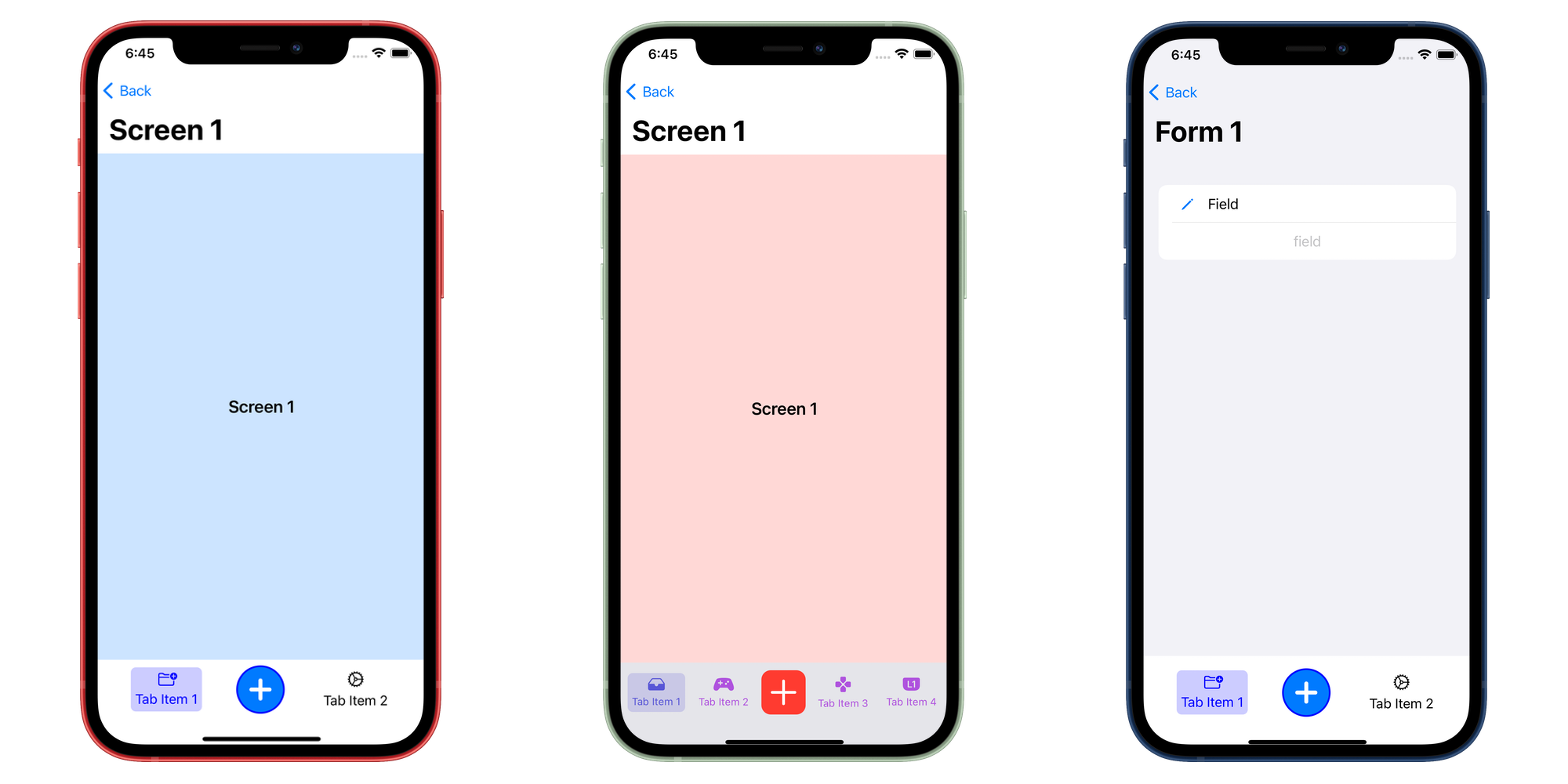
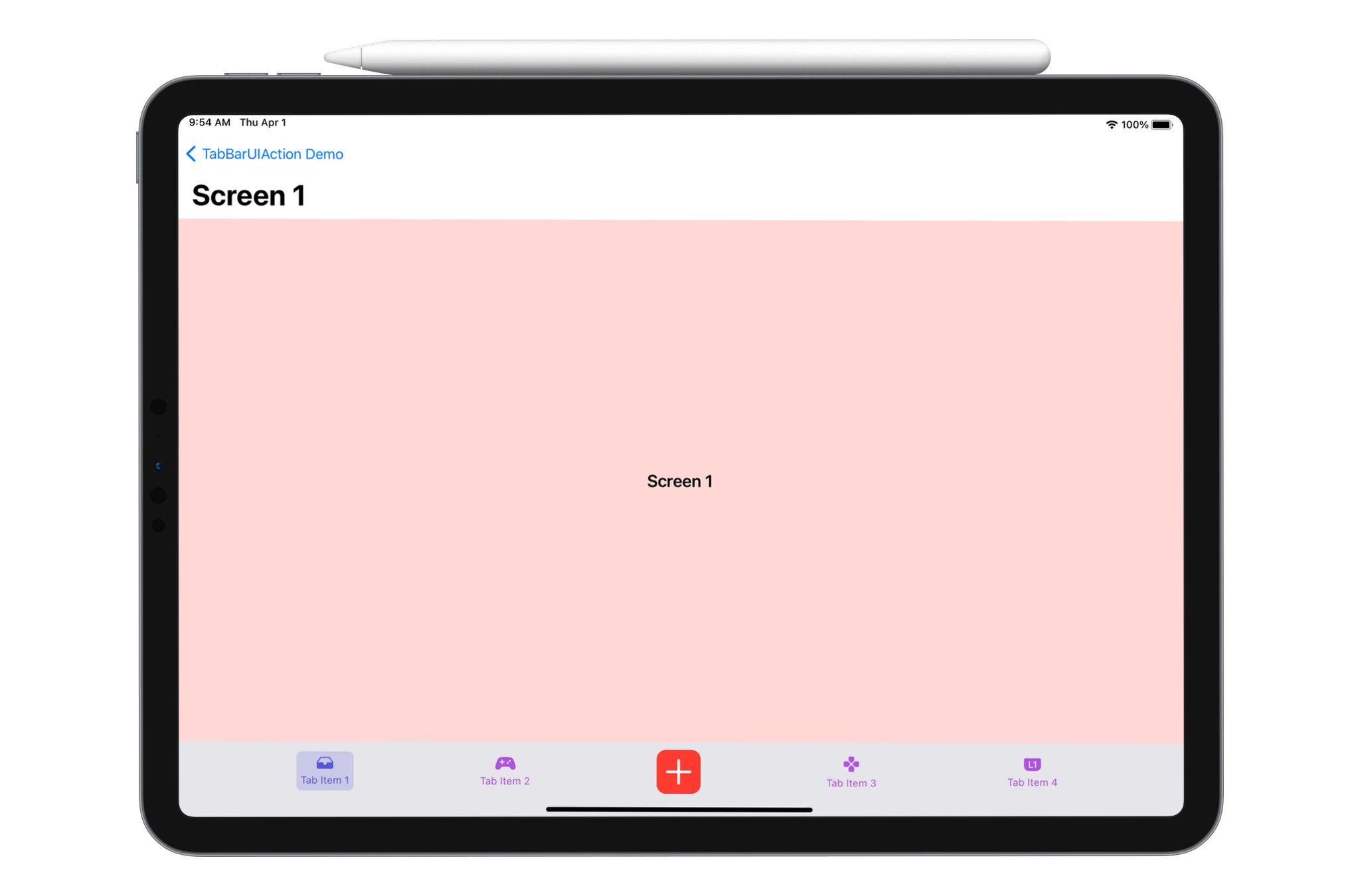
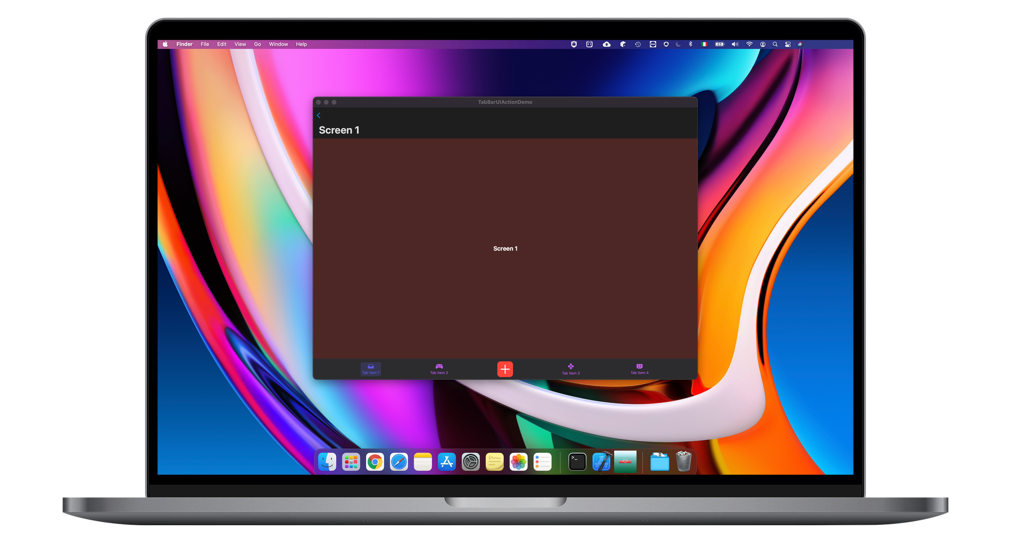
Examples
In the following screenshots you can find some TabBarUIAction usage examples. You can find these examples in the demo catalyst app project.